Is Sydney's Property Market Really That Bad? An In-depth Analysis
Being from Sydney, I am property obsessed. It must be something in the water as I am pretty sure all Sydneysiders are too. As a result, an almost daily conversation topic is about how unaffordable the property market has become and, as someone hoping to one day buy a property, I wanted to investigate this in a bit more detail (or at least have something interesting to say next time this topic invariably comes up).
Can the median income afford a median property?
This seems like a pretty good place to start as property is a ladder and so the median income should be able to afford the median property, right?
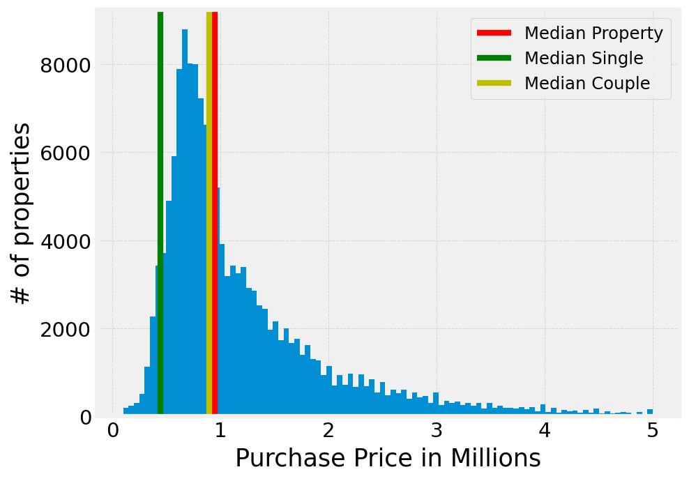
According to the ABS, the median income in greater Sydney was $1,686.6 per week in Aug 2023. If we take affordable to mean that you are spending 30% of your income on housing (i.e., you’re on the edge of meeting the definition of mortgage stress), then we can see if the median person or median couple (defined as two median incomes) can afford the median house. In these calculations, we are assuming that the imaginary buyer has a 20% deposit and are paying a rate of 6.2% (a typical rate in Feb 2024).
From the graph below, we see that the median person in Sydney cannot afford the median property, but the median couple can almost afford the median property. At first, I was a little surprised by the fact that two people on the median income can almost afford the median property given the rhetoric about how unaffordable Sydney is. But, on reflection, this might be the ladder nature of property displaying itself coupled with the fact that dual income households are the norm.
Houses vs units
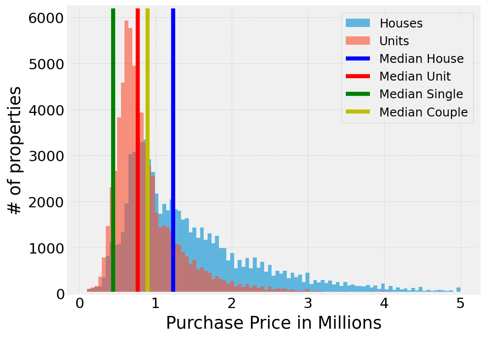
Of course, not all property is created equal with houses being much more desirable than units, so how does affordability change when looking specifically at houses vs units?
Well, what we see is the median person still cannot afford anything and that the median couple can afford slightly better than the median unit but is a long way off affording the median house.
Where can the median income afford to buy?
Sydney is big. It is almost absurd how long it can take to travel from one side of the city to the other and being so large there are definitely more desirable areas than others.
To see where in Sydney is affordable, I calculated the proportion of properties sold in each postcode which are affordable for either one or two median incomes (again, looking at repayments only).
What the next few figures show is that all the talk about the “latte line” or “Red Rooster line” or “El Jannah line” might be irrelevant when you have access to property sales data to truly look at the divide between Sydney and Western Sydney. These figures all use a diverging colour palette so are easily read with red colours showing areas with less than 50% properties being affordable and blue areas having more than 50% properties being affordable.
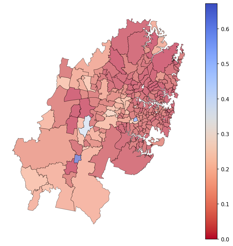
Unsurprisingly, almost the entire map is red for a single median income. Surprisingly there are exactly two postcodes affordable to a single median income: Lakemba (2195) and Menangle Park (2563). So, if you are a median Sydneysider looking to buy a place by yourself then my advice is to start looking around Lakemba.
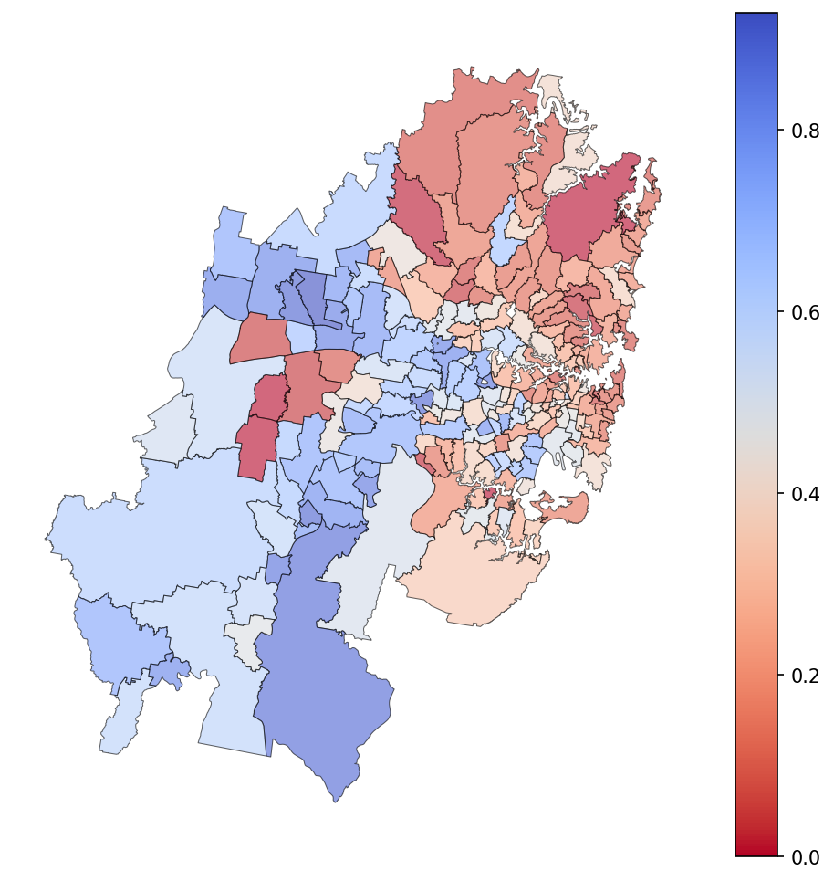
For two median incomes, the results will come to no surprise to most people that the eastern suburbs, northern beaches, north shore and parts of the inner west are largely unaffordable.
Houses vs units
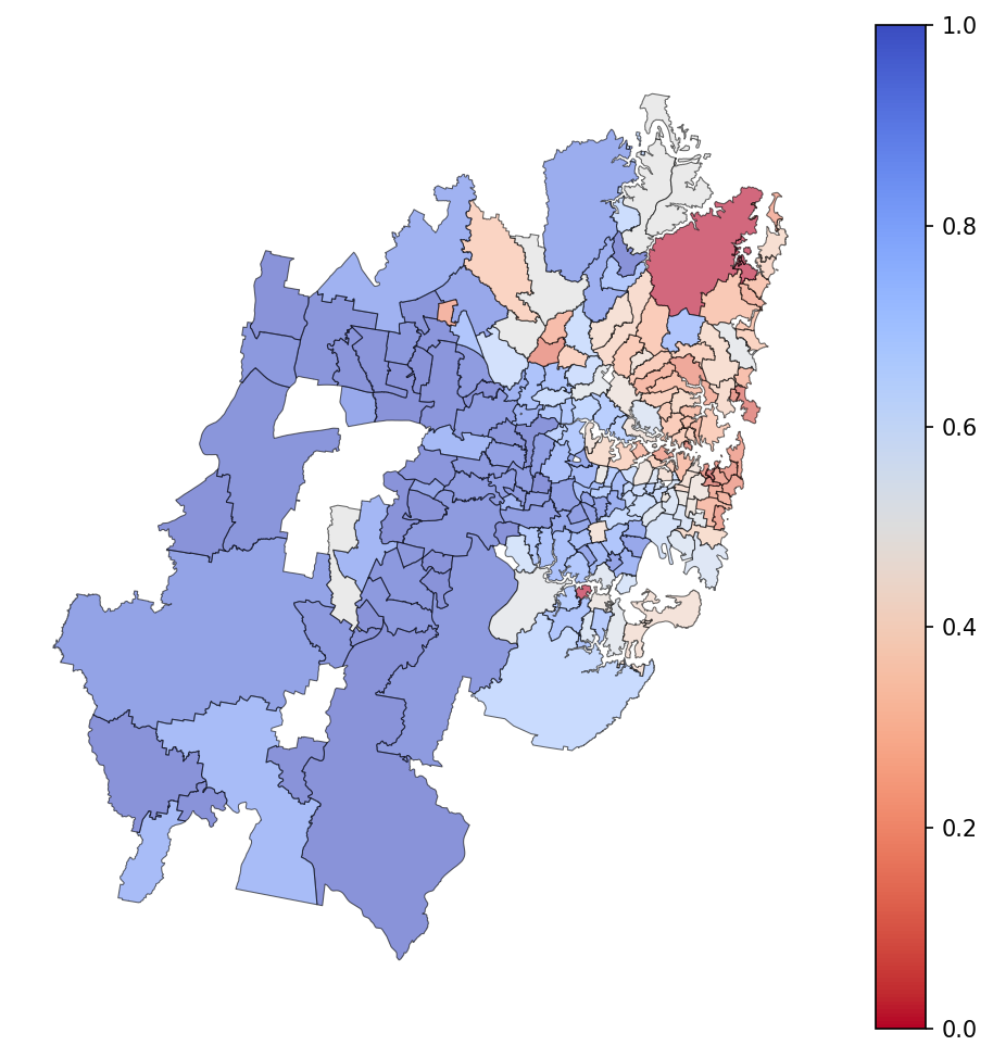
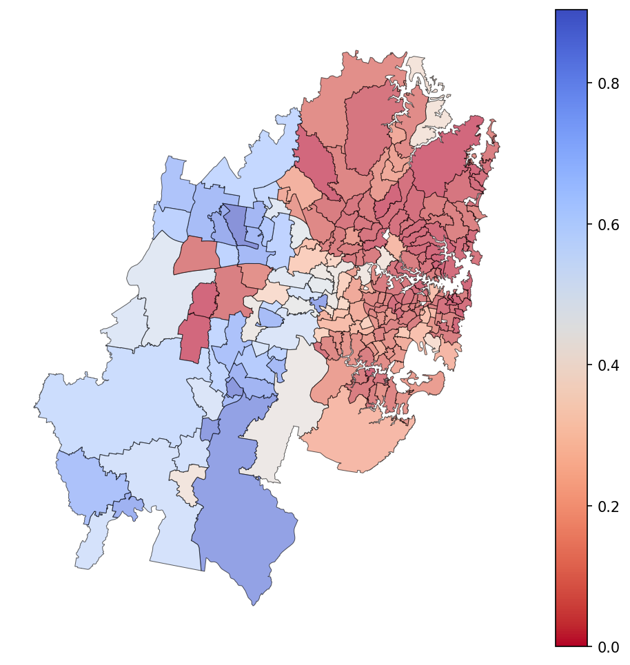
I think it is interesting to look at the locations of affordable house vs units for two median incomes as I think it really tells an interesting story.
Firstly, looking at units, the map is mostly blue meaning that two median incomes an afford a unit in most of the city except for the eastern suburbs, north shore and riverside inner west. I think a pretty good rule of thumb here is that two median incomes can afford a unit as long as it’s not near water or fancy private schools.
For houses, the story is very different with the majority of houses being unaffordable for two median incomes in almost all of the city except for the most far-flung postcodes.
Property as an investment
To me this data is very demoralising. Houses in almost all of Sydney are unaffordable to most people. Units in suburbs where living in a unit is easy is also unaffordable. How is this possible? Surely there aren’t that many rich parents buying their kids houses and foreign investors are there?
Well, Sydney (and Australia as a whole) is a bit strange in that your property is generally more than just where you live, it is also your biggest and often most successful investment. Now, this is of course a bit of a contentious topic given its basically impossible to truly cash out this investment because selling a home usually entails buying another home, but for the sake of this analysis, let’s assume we will treat property as an investment as well as a dwelling.
In this case, affordable can mean that you spend 30% of your income on housing (like in the previous analyses) plus 20% of your income on investment. Except in this case all of that is going into your mortgage.
Now, there are plenty of arguments against spending 50% of your income on housing and having your investments completely undiversified but let’s forget about all of those for now as I am sure plenty of people don’t see it that way.
With 50% of your income going to service a mortgage, suddenly the prospects of owning look a lot better or both a double median income and a single median income.

With this new paradigm where we treat property as an investment as well as well as a dwelling, it is starting to make more sense. A single median income can afford the median unit and two median incomes can afford more than the median house. What this tells us is that housing in Sydney is not treated just as housing, it is treated as your main investment, which means to keep up you have to also treat it as an investment and sink half of your pay into your mortgage if you want to keep up.
How our hypothetical median couple saves 20% for the deposit in this scenario, I’m not sure.
Where can the median income afford to sink 50% of their income?
Of course, Sydney is not all equal and even sinking 50% of your income on your housing doesn’t give you the right to live just anywhere in Sydney, especially if you want to live in a house.
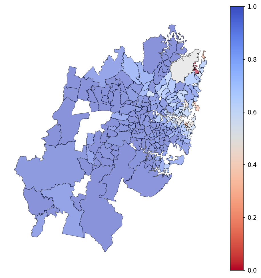
Two median incomes spending 50% of their income on their mortgage can afford most of the units for sale in all postcodes except for the most desirable by the beach or harbour.
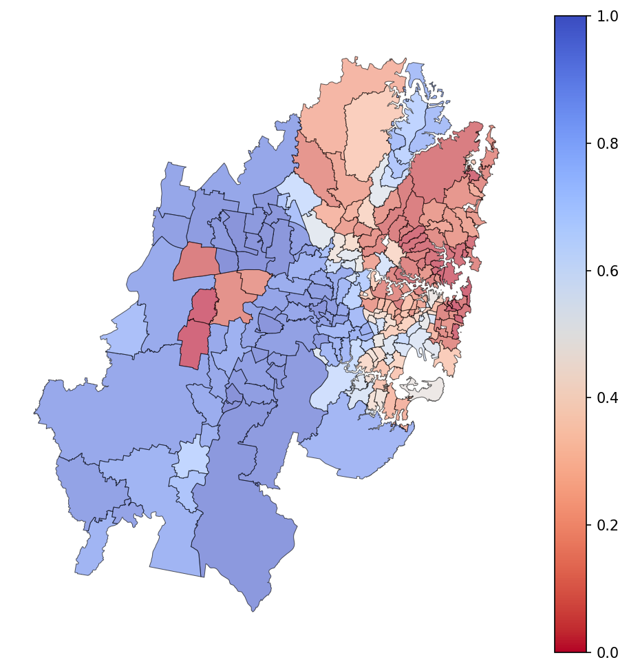
Unfortunately, for our imaginary median couple, even if the treat their house as their only investment, then they still shouldn’t dream about having a house in the eastern suburbs, northern beaches, north shore, northwest or the inner west.
How has property price changed vs income over time?
Are we living in an anomoly or has property in Sydney always been unaffordable? So far, we have seen Sydney is not very affordable but we have only looked at sales since 2020 and using the current high interest rates. What about the last 20 years?
To look at this, we can look at how much the “median couple” could afford over time and compare their purchasing power to the median property price using historical interest rates taken from the Reserve Bank of Australia.
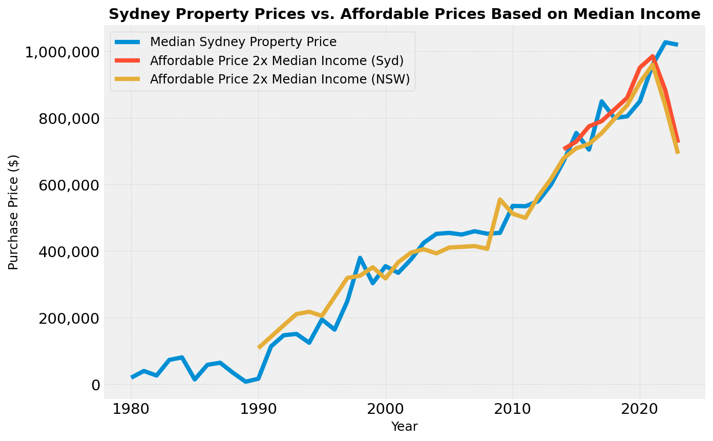
The image below shows the purchasing power of our hypothetical median couple and the median price of a property in Sydney over time.
Some notes on this analysis:
- This is assuming 30% of income spent on housing.
- We are using median NSW income as I couldn’t find median Sydney income going back past 2014 (I have plotted that too to show it’s not that different)/
- The interest rates used here are the average lender variable rates for new owner-occupier loans for a given year. These rates are slightly higher than the actual average rate due to various discounts offered by lenders but the RBA has only been tracking actual rates since 2019 so we couldn’t use that data.
Amazingly, the affordable price and the median house price line up very well! That means that from 1990 to 2021, the property ladder has been a ladder, with two median incomes being able to afford the median property.
However, in the last few years this has not been true. Rising interest rates have meant that the affordable price has decreased while there has not been a correspoinding decrease in property prices.
Now, I am not an economist so I don’t want to overstep with my interpretation here, but to me this could mean one of two things:
- As interest rates have gone up, people are sinking more and more of their income into their housing. This cannot be sustainable and there must be a large proportion of homeowners on the brink of being delinquent. If this is true, then at some point supply should increase as these owners sell and house prices should decrease.
- The dip in affordability is a temporary dip while we fight inflation and interest rates will come back down and the affordibility line will come back up to meet the property price line.
Final Thoughts
This was an interesting exercise and after looking at this data there are a few take aways for me:
- Sydney is not a good place to be single and/or a below median earner. We need more affordable housing initiatives and support for people leaving abusive relationships as the housing market seems to assume everyone has dual incomes.
- You (currently) must somewhat treat your property as an investment. This does seem a bit like a Ponzi scheme, so we have to hope Sydney’s population doesn’t decline in our lifetimes.
- It hasn’t always been so dire. The current situation is anomolous and time will tell if this anomoly is transient or a new normal.
Sources
See github repository for Jupyter Notebook.